Hi, we're Herdl Award Winning Marketing Agency
Award Winning
Digital Agency
Herdl is a data-driven digital agency specialising in Web Design, SEO and PPC. Through training, consultancy and delivery, our experienced team help brands to understand and optimise their digital performance.
Success Stories
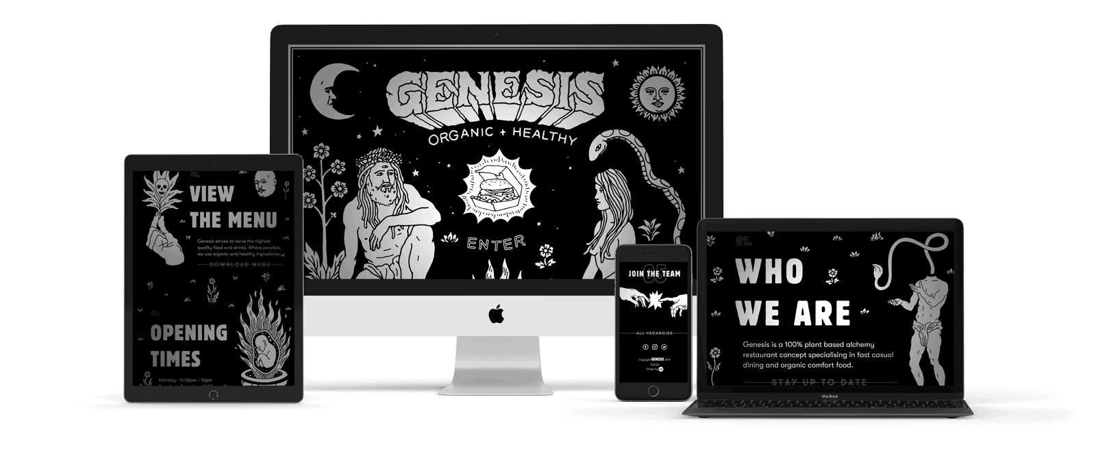
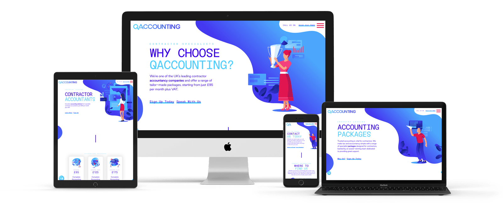
Case Studies


Marketing Services
Digital


Effective Campaigns
Meaningful Results
We pride ourselves on stripping away the red-tape that many traditional digital agencies hide behind and abide by a simple set of guiding principles that ensure we’re always working with our client’s best interests at heart. If you’re looking for a creative marketing agency who can contribute at a strategic level, implement effective campaigns and deliver meaningful results, then we’d love to hear from you.